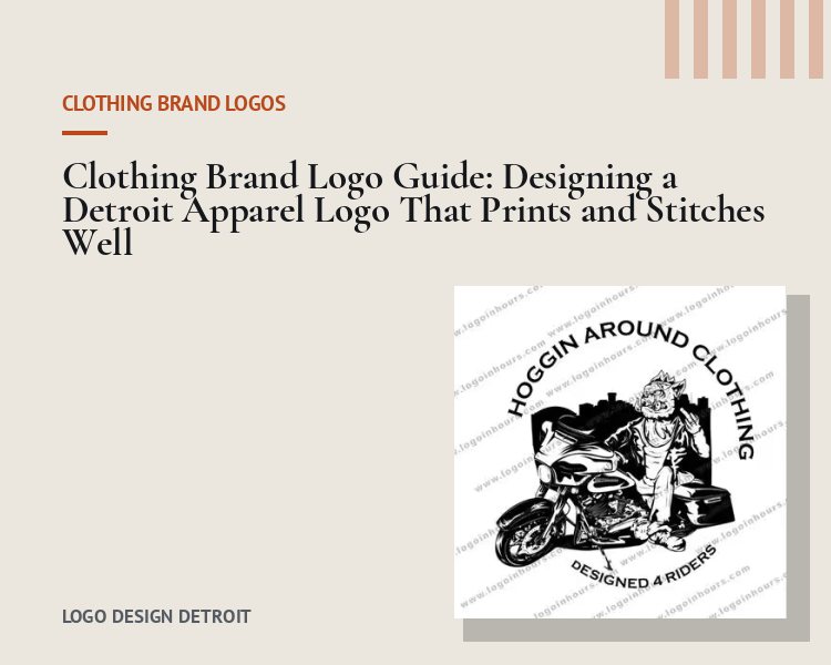
A clothing brand logo is different from almost every other business logo because the logo often is the product. People buy the hoodie partly for what is printed on it. That means your mark has to look good as fashion, not just as identification, and it has to survive screen printing, embroidery and woven labels.
Key idea: most apparel brands need a family of marks, not one logo: a wordmark for chest prints, a monogram or symbol for hats and tags, and sometimes a badge for back prints and packaging.
Choose the core mark
Wordmark. The brand name in custom or heavily customized lettering. The backbone of most streetwear and lifestyle labels.
Monogram. One to three interlocking letters. Perfect for hat fronts, neck tags and small left-chest embroidery.
Symbol. An icon that can eventually stand without the name. Harder to establish, powerful once it is.
Illustrated badge. Characters, vintage emblems or mascots for graphic-driven brands. See the Hoggin Around Clothing biker illustration in our portfolio.
Design for how clothes are decorated
- Screen printing: priced per color and per print location. Two flat colors keep margins healthy on small runs.
- Embroidery: fine lines under about 1 millimeter and tiny text will not stitch cleanly. Keep a simplified version for hats and polos.
- Heat transfer and DTF: handle detail and gradients better, which is useful for full-color graphics, but the core logo should still work in one color.
- Woven labels and hang tags: the monogram or small wordmark needs to read at under an inch wide.
Detroit influence without the cliches
The city has a strong visual heritage: automotive badges, Art Deco buildings, old-school sign painting and a deep music history. Borrowing a feeling from those sources can give a brand roots. Avoid using protected sports logos, the Old English D, or a direct copy of any well-known mark. Those create legal risk and make your line look like merch instead of a brand.
A launch checklist for apparel logos
- Primary wordmark in vector format
- Monogram or symbol for hats and tags
- One-color and white versions
- Pantone color references for your printer
- Mockups on a tee, hoodie and cap before you order stock
- A trademark search on the brand name before investing in inventory
Before you print, read our guides to logo file formats and logo copyright and ownership. When you are ready, start a clothing line logo design with a Detroit designer.